The world is losing color more than ever before. Vibrant colors, particularly bright reds, blues, greens, and purples, are gradually fading and are being replaced by more subdued grays, whites, blacks, and neutral tones. This trend has been noticed across a large swath of industries such as automobiles, interior design, fashion, makeup, storefronts, and films.
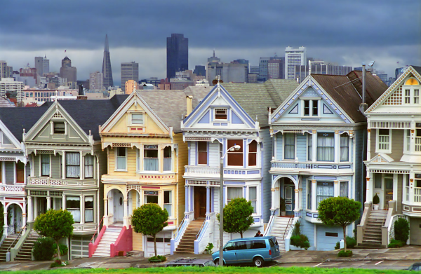 For centuries, humans have decorated their homes in bright colors, from their couches, wallpapers, rugs, chairs, and lighting fixtures to the exteriors of their homes. A key example of this is San Francisco’s iconic Victorian-era homes. The houses are painted in bright greens, blues, and yellows, gaining the name “painted ladies.” The vibrancy is not only limited to the exterior of these colorful homes, but also occupies the interior: bright wallpapers, pink couches, and lots of color adorn the homes.
In contrast, today’s residential homes look completely different. Take a look at one of Bethesda’s own homes. The difference is stark; some would call these “gray ladies.” 
However, recently, in interior design, a turn to Minimalism and Modernism has occurred. This switch may be kickstarting the switch tom neutral colors. Gray represents pure material of steel and concrete, a key facet of modernism. As modernist architect Le Corbusier famously said, “A house is a machine for living in…an armchair is a machine for sitting in.” Many modern pieces of furniture that make up interiors are entirely gray.
B-CC Junior Sam Feffer shared her thoughts: “Black, white, and gray makes stuff look more modern and cleaner [in] design rather than colorful, which is more of an old-timey look of the outside.” Feffer says, “Modern style is very in right now.” This turn to a new colorless style can be felt throughout many aspects of American life. One of them is interior design, but also commercial exterior design.
Another major trend encouraging neutral colors is Americans’ viewing homes as investments. Lately, some argue that people have been viewing their homes as less permanent and more as a way to make a profit. DC-based Interior Design professional Melissa Burnett said, “Treating a personal residence as a commodity that they’re going to, you know, maximize resale value. And the easiest way to do that is to make selections that have the broadest appeal, and that tends to send you in a direction of very neutral choices.”
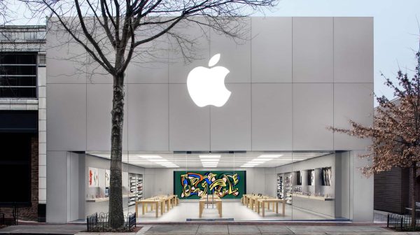 Another example is the tech giant Apple’s stores and their products. In this photo of the Bethesda Apple store, the store facade is gray, and the interior is mostly made up of stark grays and whites. Apple has done this intentionally; to many, Apple is seen in afuturistic element, representing a new digital age. By choosing to decorate their stores almost entirely with sterile tones, Apple shows what it proposes as the future, engulfed in minimalism. To Apple, gray may symbolize clean, futuristic, new, or modern aspects. Apple is a perfect case study for companies utilizing neutral colors. Apart from the Apple store, its logo also symbolizes the world moving away from color.
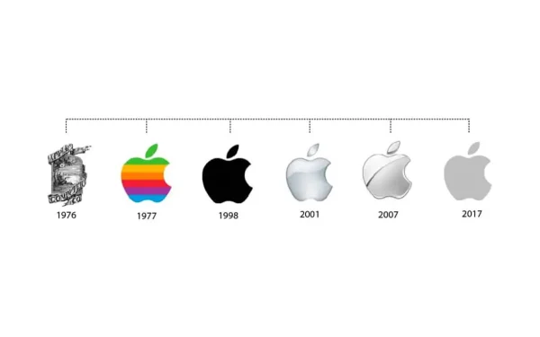
Having a rainbow bright color scheme in the 1970s, Apple slowly moved towards its signature gray logo. Don’t users miss the rainbow, chromatic apple? Once again, Apple demonstrates the movement of corporations into a colorless world.
Similarly, McDonald’s has made the switch away from color in its store exterior. Trading its bright red roof design for a gray metal roof.
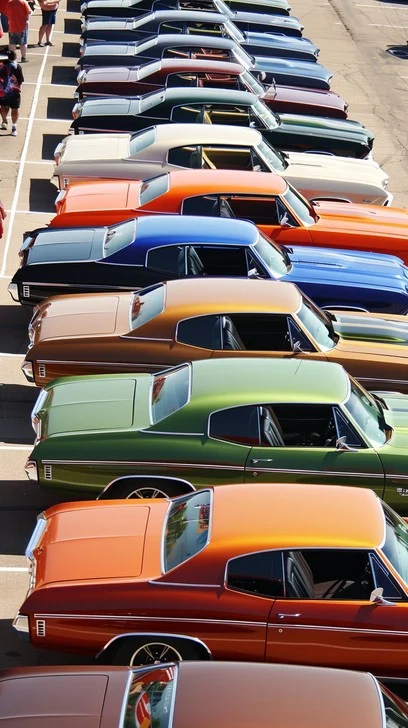
There is not just anecdotal evidence that the world is losing color, but statistical evidence as well. According to Major Auto Paint suppliers, the automobile industry has moved to over 80% new cars being on the grayscale throughout the years. 
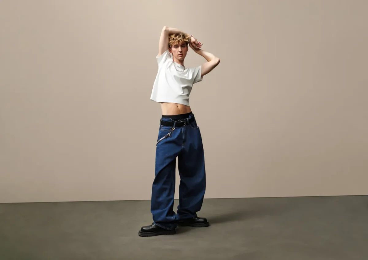
A final example of the world losing color is how society dresses. “I’m literally wearing gray, navy, blue, right now.” She added on by saying, “It is definitely harder to find fun colors [when shopping].” 
The world is losing color, but why should we care? If this trend continues, we could be living in a world where everything we interact with is neutral, nearly color-blinding ourselves. In a study done by the NIH, looking at the links between depression and color blindness, they concluded, “We found a reduction in the ability to discriminate colours in depressed patients. This finding underlines the importance of sensory deficits as part of the symptomatology of depression.” Of course, correlation does not equal causation, but there is still a correlation between depression and colourblindness. When asked how she would feel about living in a completely gray world, Claire Giuli said, “I think that’d be so depressing. That would be so sad.”
Overall, the world is losing color in every aspect of life. Next time you go out shopping, or you’re picking a new paint color, it’s worthy to consider picking a fun color to break the neutral, minimalistic cycle.